Ever noticed how a basketball court can steal the spotlight—even when the game’s off? The bold lines, polished hardwood, or weathered asphalt, paired with sun-faded paint and worn arcs, instantly radiate energy. Each court tells its own story: from neighborhood pickup games at dusk, to the high-stakes tension of professional arenas, to the raw creativity of street art. This unique blend of geometry, texture, and history makes a basketball court background more than just a backdrop—it’s a canvas packed with culture, character, and endless creative potential.
Table of Contents
Whether you’re shooting a fashion spread, designing a poster, or building a scroll-stopping social post, a court background adds motion, mood, and story in a single frame. Indoor arenas bring clean symmetry and dramatic lighting; outdoor courts offer urban texture and personality; custom designs push color and brand to the forefront. Each setting shifts the vibe and says something about your subject.
We’ve spent years crafting visuals for sports brands and creators, and we’ve learned what makes a court image pop—and what falls flat. In this blog, we’ll break down the visual appeal, cultural significance, and versatility of basketball court backgrounds, plus share practical tips for choosing or creating the right look for your project. Ready to turn lines and hardwood into your most dynamic canvas? Let’s step onto the court.
The Allure of Basketball Court Backgrounds
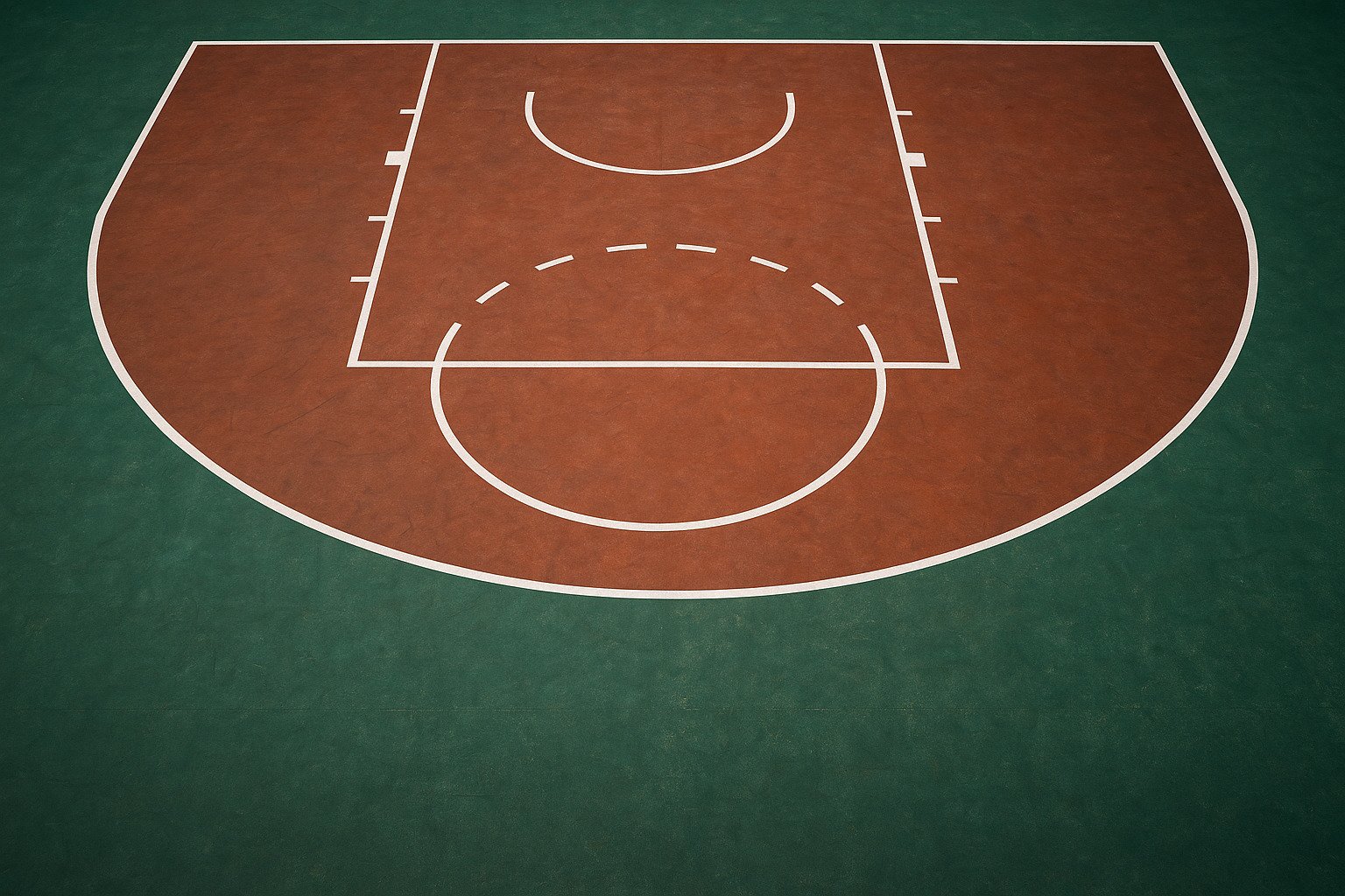
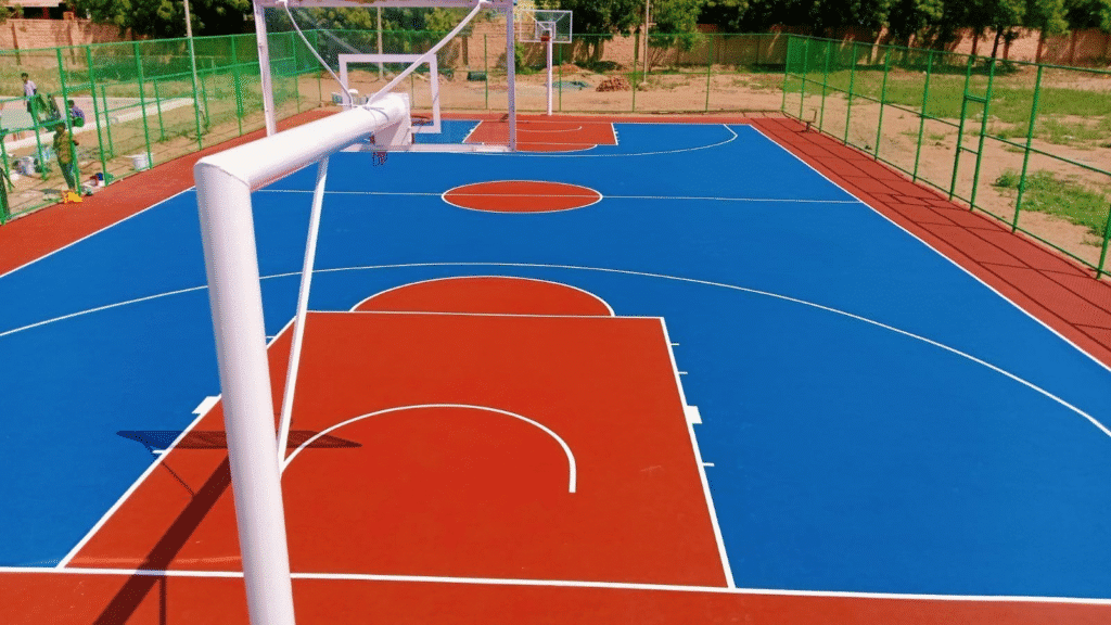
Basketball court backgrounds grab attention fast. Bold lines, high-contrast color blocks, and tactile surfaces (from polished maple to sun-worn asphalt) create instant visual structure. Those geometric cues naturally guide the eye, making subjects pop in photos, videos, and designs. Add painted keys, center logos, and boundary lines, and you’ve got built-in framing without extra props.
Courts also carry culture. They echo pickup games at dusk, neighborhood pride, and the grind of sportsmanship. Iconic spots—like Venice Beach or Rucker Park—signal urban creativity and community stories. Even a local school gym can add a sense of belonging and team spirit to your visuals.
Their versatility is the clincher. Courts fit fashion editorials, athlete portraits, brand campaigns, and scroll-stopping social posts. Indoor arenas deliver clean symmetry and controlled lighting; outdoor courts provide texture, patina, and personality. Custom-painted surfaces push color theory and brand alignment, turning the floor into a living mood board.
Try these quick uses:
- Photography: Use the free-throw circle as a natural focal point; shoot low to emphasize lines and depth.
- Video: Track along the baseline for dynamic leading lines and smooth movement cues.
- Graphic design: Sample court colors for palettes; overlay typography within the key for balance.
- Social content: Frame subjects on the three-point arc to create a bold, instantly recognizable shape.
Creative Uses for Basketball Court Backgrounds
Basketball courts make versatile backdrops that add structure, energy, and story to creative projects. Here’s how to put court backgrounds to work across photography, graphic design, social media, and event branding.
- Photography: fashion, lifestyle, and sports
- Fashion shoots: Contrast clean tailoring with gritty outdoor asphalt or pair bold streetwear with vibrant, custom-painted courts. Pose models on the three-point arc for a striking shape; shoot low to let lines lead the eye.
- Athlete portraits: Use the key as a natural frame. Position subjects at center court to anchor symmetry; add motion blur with a baseline run for dynamic action.
- Lifestyle/editorial: Capture candid scenes at golden hour on outdoor courts for warm tones and long shadows. Include scuffed paint and net details for texture.
- Graphic design: posters, ads, and digital graphics
- Layouts: Treat court lines as grid systems—place headlines along the baseline and calls-to-action within the key for instant balance.
- Branding: Sample colors from court paint to build a cohesive palette; overlay logos at center circle to echo pro-court aesthetics.
- Illustrations: Stylize court diagrams for infographics, playbooks, or campaign visuals; use half-court arcs as bold, abstract elements.
- Social media: scroll-stopping content
- Short-form video: Track along the sideline to create smooth leading lines; cut between wide court shots and tight texture details for rhythm.
- Carousels: Start with a wide court scene, then zoom into lines, textures, and typography overlays; end with a call-to-action slide.
- Challenges and UGC: Launch a “court color match” series where creators style outfits to local court palettes; encourage geo-tags to boost reach.
- Event branding: pop-ups, tournaments, and launches
- On-site visuals: Use floor decals that mirror court markings to guide foot traffic and create photo-ops. Print backdrops with half-court graphics for media walls.
- Themed signage: Integrate shot clocks, scoreboards, and locker-room typography into wayfinding and stage design.
- Merchandise zones: Display products within taped “keys” on the floor; hang banners shaped like free-throw semicircles for cohesive branding.
Examples
- Fashion campaign: A streetwear brand shoots at a custom lavender-and-gold outdoor court; the palette becomes the campaign’s color system across ads and social.
- Nonprofit event: A community fundraiser overlays court-style graphics on posters and uses numbered “sections” (like bleachers) for ticketing tiers.
- Creator series: A fitness influencer films weekly drills along the baseline for consistent framing and pairs each clip with court-diagram overlays.
Key takeaways
- Court backgrounds offer built-in composition through lines, arcs, and textures.
- They adapt to multiple formats—photography, design, social, and events—while staying on brand.
- Use court elements (key, arc, center circle) as guides for framing, typography, and movement to create cohesive, high-impact visuals.
Tips for Choosing the Perfect Basketball Court Background
Choosing the right basketball court background starts with clarity on your project’s goals. The court you pick should support your subject, reinforce your message, and fit your brand or aesthetic. Use the tips below to match purpose, color, lighting, and vibe—so your visuals look intentional and impactful.
1) Start with purpose
- Define the outcome: Are you selling a product, telling a story, or showcasing athleticism?
- Match the setting:
- Product focus: Clean, minimal indoor courts reduce distractions.
- Storytelling/editorial: Outdoor courts add context, character, and narrative.
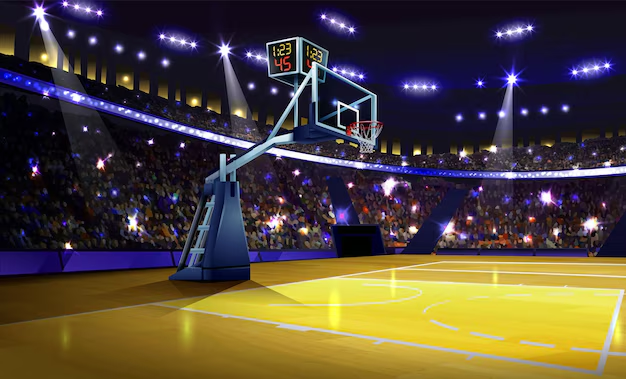
- Performance/tech: Professional arenas communicate precision and credibility.
- Tip: Write one sentence that sums up the goal. If the court doesn’t support that sentence, keep scouting.
2) Lock in a color palette
- Complement your subject: Choose court colors that don’t clash with wardrobe, product packaging, or graphics.
- Use contrast wisely: Dark outfits pop on lighter wood; bright fits shine on muted asphalt.
- Brand alignment: Sample court paint for accent colors in overlays and typography.
- Tip: Bring a color swatch or use your phone’s color picker on test photos to check harmony before committing.
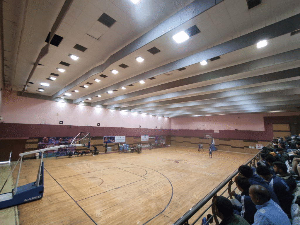
3) Consider lighting: indoor vs. outdoor
- Indoor courts
- Pros: Controlled light, consistent color, fewer weather variables.
- Cons: Can feel sterile without props or crowd elements.
- Tip: Use sideline or top-down arena lights to create dramatic shadows and symmetry.
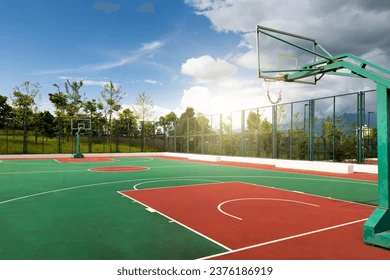
- Outdoor courts
- Pros: Rich textures, real-world mood, golden-hour magic.
- Cons: Harsh midday sun, unpredictable weather.
- Tip: Shoot golden hour for warmth and long lines; use overcast days for soft, even skin tones.
4) Choose the vibe: authentic, polished, or urban
- Authentic: Slightly worn paint, chain nets, community details. Great for lifestyle, grassroots campaigns.
- Polished: Fresh hardwood, crisp lines, clean logos. Ideal for premium products and performance stories.
- Urban: Graffiti, murals, and patina. Perfect for streetwear, music tie-ins, and youth culture.
- Tip: Decide on three vibe keywords (e.g., “raw, energetic, communal”) and evaluate courts against them.
5) Use lines and layout to your advantage
- Composition aids: The key, baseline, and three-point arc naturally frame subjects.
- Symmetry: Center court is perfect for balance; diagonals from the wing add movement.
- Tip: Position your subject where two lines intersect for an instant focal point.
6) Check condition and continuity
- Surface quality: Look for chips, puddles, or uneven floors that can cause safety issues or visual clutter.
- Continuity for series: If you’re producing a campaign, confirm you can revisit the same court for consistent visuals.
- Tip: Take test shots from multiple angles to anticipate reflections on glossy floors.
7) Plan permissions and logistics
- Permissions: Gyms and branded courts may require permits; public parks can have time limits.
- Noise and traffic: Avoid peak hours to keep backgrounds clean and audio usable.
- Tip: Bring a simple release form if you might capture bystanders.
8) Prepare for post-production
- Clean plates: Shoot empty court plates for easy graphics and retouching.
- Color grading: Neutral courts offer more grading flexibility; bold courts lock in a look.
- Tip: Capture a gray card frame to nail white balance across the set.
Quick checklist
- Purpose defined and vibe keywords selected
- Colors complement wardrobe/product
- Lighting plan (time of day or indoor setup)
- Court condition, safety, and access confirmed
- Composition plan using court lines
- Permits/logistics handled
- Post-production needs covered
When in doubt, test. Snap a few reference photos on location and review them against your goals. Share your results or questions in the comments—happy to help you choose the perfect court backdrop for your next project.
Where to Find or Create Basketball Court Backgrounds
You’ve got options—whether you need fast, high-quality visuals or a custom look built from scratch. Use the paths below to source or create basketball court backgrounds that match your project’s goals, timeline, and budget.
1) Stock photography and video libraries
Great for speed and consistency across campaigns.
- Where to look: Shutterstock, Adobe Stock, Getty Images, Unsplash (free), Pexels (free).
- What to search: “indoor basketball court,” “outdoor basketball court,” “urban court,” “center court logo,” “half court background.”
- Pros
- Large variety of styles (pro arenas, school gyms, street courts)
- Clear licensing options; easy to scale across teams
- Time-efficient; often includes 4K/RAW files
- Cons
- May feel generic or overused
- Limited control over angles, lighting, and branding
- Tip: Filter by orientation (vertical for Reels/TikTok, horizontal for banners) and color palette to match your brand. Save similar images from the same series for visual continuity.
2) AI-generated backgrounds
Ideal for unique looks, brand colors, or concept visuals without location logistics.
- Tools to try: Midjourney, Adobe Firefly, Stable Diffusion, Canva’s AI tools.
- Prompts to start: “Polished indoor court with dramatic overhead lights,” “Weathered asphalt court with vibrant mural,” “Minimalist half-court graphic in brand colors [hex codes].”
- Pros
- Infinite customization (colors, textures, logos, camera angles)
- Fast iteration; great for mockups and rapid testing
- Can create idealized lighting and clean compositions
- Cons
- Potential realism issues (warped lines, odd textures)
- Licensing and usage policies vary by platform
- May require editing skills to reach production quality
- Tip: Generate multiple versions, then refine with inpainting/outpainting. Always stress-test realism by checking line geometry (key, arc, baseline) and wood grain or asphalt texture.
3) Shoot at local courts
Perfect for authenticity, storytelling, and community-driven projects.
- Where to scout: Public parks, school gyms, community centers, private training facilities.
- What to look for
- Condition: Fresh paint vs. patina; avoid cracks or puddles
- Light: Golden hour for warmth; overcast for soft skin tones
- Features: Murals, chain nets, center logos, unique colorways
- Pros
- Real textures and atmosphere that read well on camera
- Flexible angles and compositions
- Community connection and location-specific identity
- Cons
- Permits may be needed; crowds and noise can be issues
- Weather and scheduling constraints
- Inconsistent lighting indoors if fixtures vary
- Tip: Visit at two times (early morning, late afternoon). Take test shots at baseline, key, and center circle. Bring a microfiber cloth for glossy floors and a polarizing filter to control reflections.
4) Design custom court backgrounds
Use graphic tools to build clean, on-brand visuals for campaigns and overlays.
- Tools: Adobe Illustrator, Figma, Affinity Designer, Photoshop for textures; Blender for 3D courts.
- Approach
- Start with regulation dimensions for accurate proportions (key width, three-point arc radius)
- Apply brand palette to paint zones; add subtle wood or concrete textures
- Export layered files to swap logos, type, and colors quickly
- Pros
- Total control over composition, color, and branding
- Scales across print, web, and motion
- Easy to maintain consistency across a series
- Cons
- Requires design skills and time
- Can look too “clean” if you need gritty realism
- Tip: Add light grain, scuffs, or vignette to avoid a sterile feel. Use perspective grids so arcs and baselines look correct in mockups. Keep a master template for rapid iterations.
5) Hybrid approach: photo + design
Combine photography with graphic overlays for the best of both worlds.
- How to do it: Shoot a clean plate of the court, then add typography, arrows, or play diagrams in post.
- Pros
- Real-world texture with brand-forward design
- Reusable base images across campaigns
- Cons
- Requires coordination between photographer and designer
- Tip: Leave negative space in the frame (e.g., open half-court) for type and graphics. Capture a few angles to fit different placements (stories, thumbnails, hero banners).
Quick scouting checklist
- Purpose and vibe defined (authentic, polished, urban)
- Color harmony with wardrobe/product
- Lighting plan (indoor setup or time of day)
- Access/permits confirmed; crowd levels acceptable
- Composition tested using court lines (key, arc, baseline)
- Backup option prepared (stock or AI) if weather changes
Key takeaway: Pick the path that fits your timeline, control needs, and brand story. Stock is fast, AI is flexible, local shoots are authentic, and custom design is precision—mix and match to create backgrounds that elevate your project.
Conclusion
In short, basketball court backgrounds deliver bold visuals, carry cultural weight, and adapt to everything from photos and graphics to social and events. With the right purpose, color palette, lighting, and vibe—and options like stock, AI, local shoots, or custom design—you can shape a backdrop that elevates your story. Ready to put these ideas to work? Share your favorite court background concepts or recent projects in the comments, and tell us what you want to create next. For more inspiration, check out our sections on creative uses and tips for choosing the perfect court.